Kyocera Unlimited Plan
Created a subscription discovery experience for Kyocera's Unlimited Plan.
Role
UX Designer
Timeline
Nov 2025 - Jan 2026
Team
1 Director, 1 Product Manager, 1 Designer
Tools/Skills
Figma, Wireframing, Prototyping
SUMMARY AND IMPACT
I led the design and product vision for the way customers discover their printing needs.
I worked for Kyocera as the sole UX Designer to create a brand new digital experience for a printing subscription service. Some of my accomplishments included:
1
Led the market research and design to optimize the landing page and sign-up experience.
2
Owned the end‑to‑end product vision, partnering with cross‑functional teams to define the customer journey.
3
Drove the branding and visual direction for final product presented to Kyocera stakeholders.
MARKET RESEARCH
To understand the problem space, I researched top competitors.
Kyocera’s competitors demonstrate strong branding and comprehensive product offerings, but often lack a smooth, guided experience for new customers unfamiliar with printing terminology.
Top Competitors


✔️ Strengths
Established brand presence
Comprehensive product and services
Clear content hierarchy
Detailed specs for experienced users
❌ Weaknesses
Long, unclear multi-step flows
Confusing terminology for new users
Too much information on one screen
Outdated or inconsistent visual design

Design Challenge
How might we help customers easily understand and choose the right printing solution for their needs?
CORE FEATURES
I defined four core feature areas for the subscription experience
Based on market research and competitor insights, I mapped these to key features focused on clarity, guidance, and conversion.
🔍 Guided Subscription Flow
Help users find the printer and plan that fits their business
🏠 Landing Page Redesign
Highlight plans clearly with intuitive layout and strong branding
📊 Product & Plan Interface
Make plan choices easy to compare and understand.
📝 Form Design Optimization
Simplify forms for usability and accessibility
DESIGN DECISIONS
Designing a guided subscription flow for printer discovery
The goal was to create a clear and approachable way for businesses to identify the right printer and subscription without feeling overwhelmed by technical details.
Initial Hypothesis
If users could view and complete all questions in a single form and provide contact upfront, we could:
Quickly capture qualified leads
Understand business context early in the flow
Move users efficiently toward a recommendation
First Solution: I designed a flow that included contact information (name, company, email) as the first step, followed by a one-page questionnaire about printing needs.


User feedback showed that all questions upfront felt overwhelming

Design Insights
Value should be demonstrated before requesting personal details.
Users want to understand what they’ll receive before committing
Showing relevance first increases willingness to engage
FINAL DESIGNS
From discovery to decision in one guided experience
I redesigned the experience into a guided subscription flow that balances personalization, trust, and clarity.
Personalized Step by Step Flow
A question-by-question experience to reduce cognitive load.

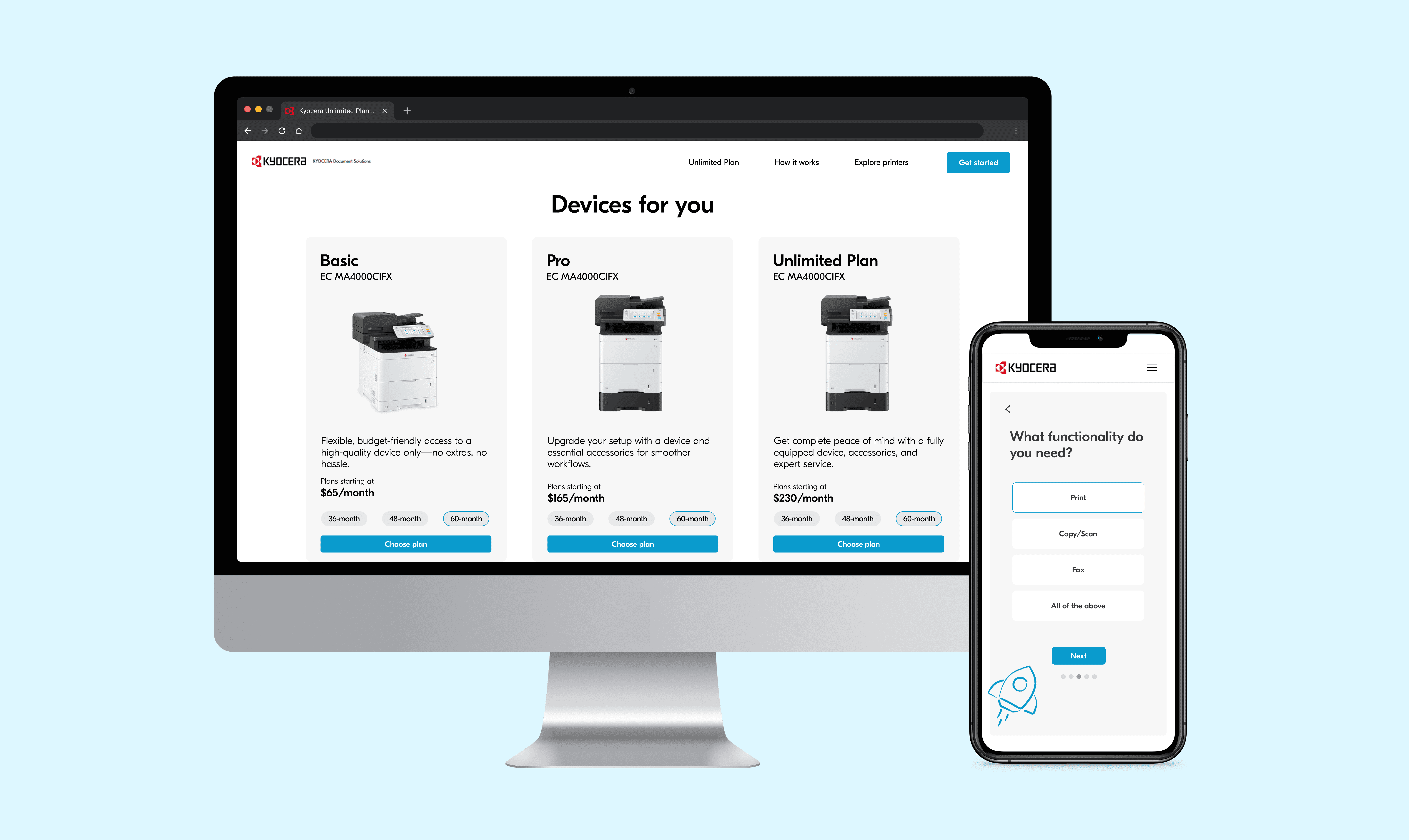
Side by Side Plan Comparison
Basic, Pro, and Unlimited plans shown together with a feature table.
Dynamic Loading State
A rocket launch animation adds momentum while loading.

Value First Lead Capture
Contact details are collected with the recommendation in a checkout-style flow.
Designing entry points for different user intent
The Unlimited Plan landing page was optimized for streamlined sign-up and lead capture for users already interested in the plan.
Focus areas:
Simplifying the sign-up form to reduce friction
Improving clarity around required information

Original landing page lacked a clear sign-up CTA

Redesigned page with upfront sign-up form
The guided subscription flow landing page was designed for users ready to explore a personalized plan, this entry screen sets expectations for a step-by-step experience.
Focus areas:
Introduces the guided workflow clearly and concisely
Signals personalization and relevance from the first interaction
Page highlights:
Multiple CTAs placed throughout the page
Consistent branding of the color blue and Kyocera icons
Pricing cards that clearly differentiate plans
Benefits section that communicates value
FAQs and a “Get in Touch” section to support further inquiry

TAKEAWAYS
Lessons from designing within constraints
It was a great experience working with my team and learning how to design within a new problem space. Designing for a product that operates within clear technical and brand constraints challenged me to be more intentional in my decisions and helped me grow as a more thoughtful designer.
Key takeaways
Studying strong, industry-standard design help me better critique my own work and recognize patterns more quickly
Designing for a more complex and constrained space, such as printing, highlighted the value of digital design and pushed me to think more tactically about usability, feasibility, and edge cases
While bringing visual taste and aesthetic appeal to a product is important, I learned that adhering to brand guidelines is essential to maintaining a clear and consistent brand identity