
CERTIFYIQ · PRODUCT DESIGN · 2026
Redesigning CertifyIQ for
4× higher conversion
Rebuilt the mobile experience as the sole product designer, then scaled it across plumbing and electrical exam prep.
4x
Onboarding Conversion
15% → 59%
+27pp
Sign-up → Home
52% → 79%
2
Mobile apps shipped
iOS + Android
Product Designer
•
March 2026 - Present
•
2 Founders, 1 Designer
Figma, Amplitude, Claude Code
01 / Problem
AI is restructuring white-collar work → demand is shifting to the skilled trades.
The bottleneck isn't technology. It's people. Not enough tradespeople to do the work. The goal is to make certification easier to break into, so more people can build careers in the trades.
After 600+ interviews, we found the real problem: apprentices get stuck.
THE REALITY
Why apprentices get stuck
The same four barriers came up again and again across our interviews.
Stranded hours
Unpaid gaps between placements kill momentum.
Low exam confidence
Thin prep and nerves drag down pass rates.
Low union slots
Too few openings to actually move up.
Poor mentorship
Little guidance when it matters most.

INTRODUCING CERTIFYIQ
Exam prep built to get apprentices certified faster
CertifyIQ turns scattered study time into a clear, guided path — adaptive practice exams, real progress tracking, and bite-sized lessons that fit around a working apprentice’s schedule.


Adaptive mock exams
Timed, trade-specific tests that adapt to weak spots and mirror the real certification.
Progress you can see
Readiness scores and topic breakdowns so apprentices always know what to study next.
Bite-sized lessons
Short, focused study units built to fit between shifts and site work.
08 / APP PERFORMANCE
Conversion went from 15% → 59%: a 4X lift in users reaching the Home screen
Using Amplitude to analyze the funnel, I found the biggest wins came at the first two screens, where far fewer users dropped off. The final sign-up-to-Home step nearly doubled, from about 52% to 79%.
02 / CertifyIQ
Two founders. First designer. Two live apps.
As the sole designer, I took initiative on the research, UI, and branding of CertifyIQ. I started by auditing the old version of the app and analyzing conversion data on Amplitude.
PLUMBER V1 DESIGNS
Where V1 fell short
Version 1 had solid structure, but there were many problems causing a lack of trust in the app. The branding was all over the place, with too many competing colors, not elliciting trust. There were also legibility issues and a lack of visual hierarchy in the text. The illustrations were juvenile, causing drop-offs starting from onboarding.


Leaky funnel
70% of users churned within 2-3 weeks.
The app worked but didn't look compelling or trustworthy enough to stay.

03 / My Role
Building trust and brand
To resolve onboarding and retention, I focused on:
Building trust during Onboarding
Modernizing the UI and Brand
Shaping brand credibility through marketing
THE APPROACH
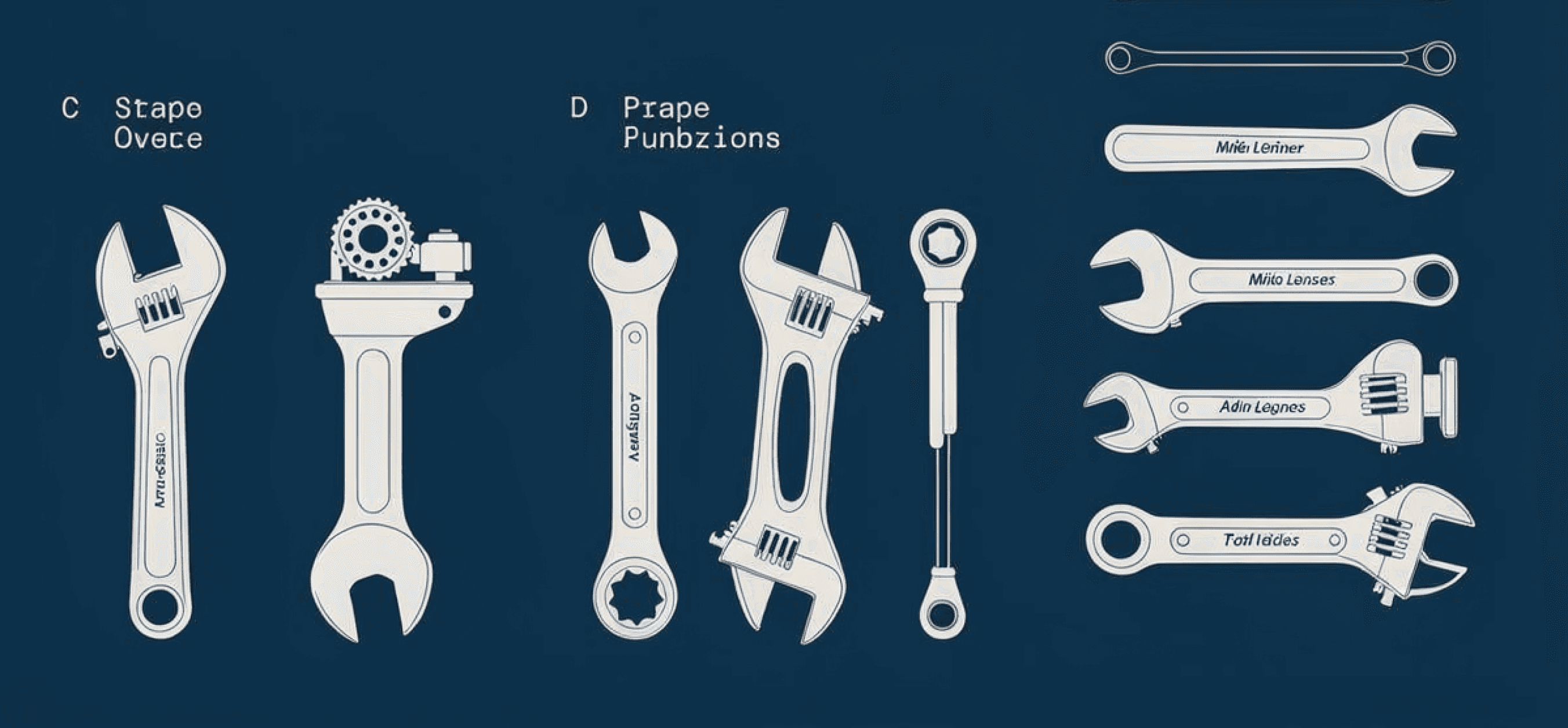
Exploring 3 design territories
Before diving into the UI, I explored new brand directions for CertifyIQ. I came up with three very different styles to see what would resonate most with our audience. I brainstormed concept images and created design systems and illustrations for each direction.

1.) Analog
The first direction has an analog, user manual feel to it.
Pros
Feels like a reference tool more than a generic quiz app
Diagram-like illustration replaces stock images
Cons
Diagrams are difficult to generate accurately
Competing trades exam prep apps already use this color palette



2.) Metal
The second direction has a modern, monochrome aesthetic.
Pros
There's minimal UI chrome, maximum content density
Neutral palette avoids the gamified look of competing apps
Cons
The color palette lacks vibrance and might end up looking too dull


3.) Tradesman
The third direction has an industrial look with a solid color palette .
Pros
Symbolizes the plumbing trade through water-pipe imagery
Neutral palette with a pop of blue adds just enough vibrance
Branding reflects 20th-century modernism which emphasizes simplicity and functionality


04 / Onboarding
Gaining trust from the start
Designing a cohesive, visual onboarding
Water pipe loading screen
IPC/UPC code selection
Bolder and concise paywall

Choose your state code
State selector is the #1 product differentiator
Users explicitly name their state and ask for content matched to their actual exam
THE APPROACH
Exploring 3 design territories
Before diving into the UI, I explored new brand directions for CertifyIQ. I came up with three very different styles to see what would resonate most with our audience. I brainstormed concept images and created design systems and illustrations for each direction.
05 / Quiz-taking
Improving the exam prep experience
Reimagining the quiz design to match the new branding
No modal form style
Progress bar
No clashing colors, simple background
BEFORE AND AFTER
Transforming the entire app
After the new onboarding implementation, I continued to redesign the rest of the app with a focus on the quiz-taking experience. While applying my new design language, I paid close attention to the visual contrast, usability, and legibility of the screens.
Quiz Question

Quiz Question V1

Quiz Question Redesign
The modal style for quizzes made the screen more cluttered and was not necessary functionally, In the new design, I made the question into a flash card style and got rid of the borders for answer choices. I also changed the radius to be less rounded, giving it a more professional look. I changed the thumbs down icon to a flag icon, which is more familiar for flagging a question.
Quiz Results

Quiz Results V1

Quiz Results Redesign
The v1 designs for quiz results looked elementary with floating cards and a busy background. In the new design, I focused on the visual hierarchy of the stats, condensing the information into one bold card design. The "correct" and "incorrect" buttons did not look clickable in the original design, so I made sure to clarify that with arrows. I created progress bars for a clearer demonstration of correct and incorrect answers by topic.
Mock Exam

Mock Exam V1

Mock Exam Redesign
The mock exam feature is one of the most important features of the app, where users can experience the exam as closest to real time. In the first design of mock exam, the instructions were very dense with important information lost in the pile. In the new design, I focused on demonstrating the numbers boldly first, then listing out the instructions step by step. This makes the information more easily scannable.
06 / DESIGN SYSTEM
Designing for both light and dark modes
I consolidated the palette down to two primary colors, navy and gray. Keeping the base neutral helps the accent colors carry real meaning instead of competing for attention, which creates a calmer, more focused study environment. I also designed the full system for both light and dark modes.

I went with Inter for the type. It's clean, modern, and really easy to read. For radius, I went with less-rounded corners. It gives the whole app a more structured, serious feel.

07 / ADS & MARKETING
Bringing the brand to market
Coming from a product design background, I had to adapt to designing for ads and marketing. I worked closely with the founders to learn their approach: what had worked, what hadn't, and where they wanted to push. To move fast without sacrificing quality, I leaned on AI tools like Claude and Weavy to produce promotional materials quickly while keeping everything sharp and on brand.
The app is live on the App Store and Google Play.


08 / APP PERFORMANCE
Conversion went from 15% → 59%: a 4X lift in users reaching the Home screen
Using Amplitude to analyze the funnel, I found the biggest wins came at the first two screens, where far fewer users dropped off. The final sign-up-to-Home step nearly doubled, from about 52% to 79%.

09 / AI TOOLS
Leveraging AI to speed up the process without losing quality
As the sole designer, I wore multiple hats throughout the design process. I leveraged AI to keep up with the pace without losing quality. I used Claude Code and Claude Design to turn concepts into prototypes, and Weavy, Kling AI, and Veo 3 to generate ads and videos for our App Store and Google Play launches.
Design Directions
When exploring design directions, I used Weavy to iterate on branding and get matching assets. I started with a refined prompt and explored multiple reference images and color palettes to get the desired outcome.

App Icon Design
Getting the app icon right took a lot of prompting. Claude gave me plenty of directions to explore, but none of them fully captured the exact vision I had. So I kept feeding it my taste and references, refining the prompt each round until the output landed as close to my vision as possible.


Screen Iterations
For screen iterations, I worked with Claude Design and Claude's Figma MCP to move fast. Claude Design got closest to what I had in mind, and I used it mostly to explore micro-interactions and alternate layouts.



10 / ELECTRICIAN APP
Launching the Electrician App
After the plumbing app launch did well, I moved on to redesign the electrician app. I carried over the same design language but gave electrician its own color palette to set it apart. Where plumbing leans on water and pipe imagery, electrician draws on electric circuit imagery.
The app is live on the App Store and Google Play.
